Le Grand
→ 18 Styles
→ 585 Glyphs per Style
→ 2 Variable
→ From CHF 200
TypeHere
Aa
Types to they that be of the craft are as things that be alive. He is an ill worker that handleth them not gently and with
Type here
Formats
Variable font (TTF, OTF, WOFF2)
+ 18 single styles (OTF, TTF, WOFF2)
Languages
Afrikaans, Albanian, English, Asu, Low German, Basque, Bemba, Béna, Cape Verdean, Catalan, Cebuano, Cisena, Cornish, Corsica, Mauritian Creole, Spanish, Estonian, Filipino, Finnish, French, Friulan, Scottish Gaelic, Galician, Gusii, Ido, Indonesian, Interlingua, Irish, Isangu, Italian, Javanese, Jju, Kalendjin, Kiga, Kinyarwanda, Lojban, Luo, Luxembourgeois, Luyia, Makondé, Makua, Malay, Malagasy, Mannois, Matchamé, Northern Ndebele, Ndebele South, Nyankolé, Occitan, Oromo, Portuguese, Romansh, Rombo, Roundi, Rwa, Samburu, Sango, Sardinian, Shambala, Shona, Soga, Somali, Northern Sotho, Southern Sotho, Swedish, Swiss German, Swahili, Swati, Taita , Taroko, Teso, Tsonga, Tswana, Vunjo, Walloon, Xhosa, Zulu
Le Grand
In the realm of type design, few endeavors resonate with the depth and devotion found in Ian Party’s lifelong engagement with the Romain du Roi. This journey, spanning decades, is not merely about reviving a historical typeface but about reimagining its essence for contemporary times.
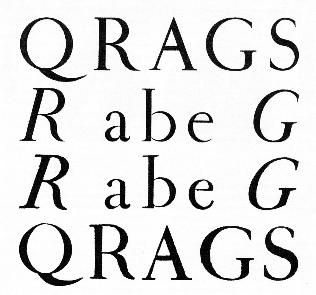
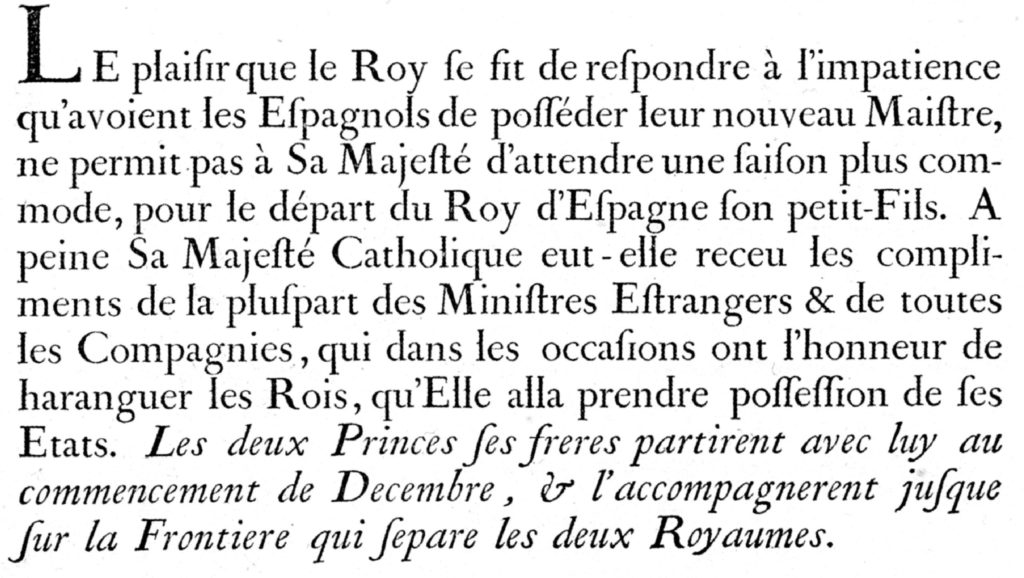
The original Romain du Roi, commissioned by King Louis XIV in 1692, was a product of the Enlightenment—a typeface born from rational design principles, meticulously crafted by the Bignon Commission and engraved by Philippe Grandjean. It stood as a symbol of the monarchy’s authority and the era’s intellectual rigor.

Ian Party’s fascination with this typeface began during his studies at the École cantonale d’art de Lausanne (ECAL) and deepened at the Type and Media program at The Royal Academy of Art in The Hague. His master’s project was a contemporary interpretation of the Romain du Roi, setting the stage for a career-long exploration.
In 2004, Ian co-founded B&P Typefoundry, which later evolved into Swiss Typefaces in 2013. Here, he released the initial versions of Romain BP and SangBleu BP (a lighter version of Romain BP), a typeface family that drew inspiration from the Romain du Roi’s structural elegance. By 2017, Ian had expanded SangBleu into a comprehensive collection—Empire, Kingdom, Republic, Versailles, and Sunrise—each reflecting different facets of typographic expression.
After selling Swiss Typefaces in 2019, Ian established Newglyph, a new venture allowing him to delve deeper into his typographic pursuits. Among Newglyph’s offerings is a modern reimagining of the Romain du Roi, not as a mere revival but as a continued quest to capture its spirit—one that celebrates the marriage of geometric rationality and elegance, of science and craftsmanship.

Conceived around the soft, crescent-like shapes of the ‘b’, ‘d’, ‘p’, and ‘q’, the design subtly appropriates regal motifs, including a distinctively adorned lowercase ‘l’, marked not by a simple additional serif but by what might be described as a typographic gesture of precision and flair. Rather than mimicking history, these ideas are synthesized and pushed toward something more radical, more distilled, and unequivocally more modern.

Technically, this contemporary Romain du Roi explores the full capabilities of variable font technology, with axes for weight, width, and contrast, yielding 108 styles in total. Alternates and small caps are available throughout the family as OpenType features.
At the heart of this typographic symphony lies a duet: Romain du Roi, the refined and articulate text family—crafted for rhythm, readability, and grace across long passages—and Le Grand, its dramatic and sculptural counterpart. Designed expressly for headlines, Le Grand is bold and theatrical, built with high contrast and typographic presence. Where Romain du Roi whispers with clarity in the flow of body copy, Le Grand declares, embellishes, and elevates. Together, they are two voices in harmony—serene and sonorous—each enhancing the other’s character, strength, and intent.
One will also find distinguishing details such as double serifs on lowercase letters like ‘b’, ‘d’, ‘h’, ‘k’, and the aforementioned ‘l’, each accentuated with careful articulation—a fusion of grace and rigor. These flourishes are not ornamental excess but rather deliberate gestures that honor the past while looking firmly forward.
Ian Party’s rendition of the Romain du Roi is a testament to his commitment to bridging historical reverence with modern design sensibilities. It is a narrative of passion, precision, and the enduring allure of typographic artistry.