Romain du Roi
Ian Party’s lifelong dialogue with the Romain du Roi has culminated in a typeface that transcends revival — celebrating the union of geometric rationality and elegance, of science and craftsmanship. Born from Enlightenment ideals and reimagined through decades of research and design, this modern interpretation is a powerful synthesis: 108 styles with variable axes in weight, width, and contrast, and features like alternates, small caps, and distinctive double serifs. It draws inspiration from crescent shapes and regal flourishes, including the signature finial of the lowercase ‘l’.
The collection is composed of Romain du Roi, a refined text family, and Le Grand, a sculptural headline companion — two voices in harmony. One speaks with clarity and rhythm, the other declares with contrast and grace. Together, they carry centuries of typographic legacy into the future with contemporary precision and poetic flair.
→ 108 Styles
→ 585 Glyphs per Style
→ 2 Variable
→ From CHF 200
TypeHere
Aa
Types to they that be of the craft are as things that be alive. He is an ill worker that handleth them not gently and with
Type here
Most Sacred Majesty: On the 22nd day of the month of May of the year 1678, I dispatched from an unknown location, off the coast of Mexico, to the Madeline de Brest , a vessel, and in her a servant of mine, with orders to pass on my letter and its contents to your Majesty. I’ve encountered the people of these distant parts. It seems to me important that your Highness should become acquainted with my doings. I will therefore narrate some events plainly and to the best of my ability. I will describe only the principle and most remarkable incidents of said journey. Great discoveries have been made in your Majesty’s name. Mexico holds unfathomable quantities of gold, and silver, much beauty can be found in this savage place. As your Majesty is aware, this new world is also being explored by the Spanish. Our expedition avoids the Spaniards at all costs. This is to fend off any battles that may occurred if our two parties met. Most of the lands have not been touched by the hand of man. Roads and passages can hardly be found here. The mountains are so high and the forests so thick and impenetrable, that we could only see the spot where we placed our feet. Looking upwards, blue skies disappeared over our heads, the trees so tall and so close to each other, that those who climbed up them to discover land could not see beyond a stone’s throw . We found a village with several maize plantations in the finest of possible conditions. We also found other provisions, fowls, honey, beans and other produce of the land. The natives, if there were any at this place, not having shown themselves or made any oppositions, my men carried with us as much as we could back to the ship. Our provisions were running scare at this time. It was indeed a most welcome discovery and compensation for all our past troubles, for had we not found it at that moment, we should all have perished through hunger. The Mexica Empire, tribes, and peoples hold so many dark and mysterious secrets. They are ruthless heathens, with many gods that hunger for human sacrifice and blood. It happened that one of my men saw one of the Indians who had come with me from the Tenuxtitlan eating a piece of flesh taken from the body of another Indian, whom he had killed on entering Iztapan. When the case was reported to me, I had the Indian arrested, and there, in the presence of all, had him burnt alive, for having slain and afterwards eaten of the fellow creature. An abomination, which your Majesty, and myself in your royal name, have repeatedly condemned, ordering the people of these parts to abstain from doing.
Most Sacred Majesty: On the 22nd day of the month of May of the year 1678, I dispatched from an unknown location, off the coast of Mexico, to the Madeline de Brest , a vessel, and in her a servant of mine, with orders to pass on my letter and its contents to your Majesty. I’ve encountered the people of these distant parts.
Format
Variable font (TTF, OTF, WOFF2)
+ 108 single styles (OTF, TTF, WOFF2)
Languages
Afrikaans, Albanian, English, Asu, Low German, Basque, Bemba, Béna, Cape Verdean, Catalan, Cebuano, Cisena, Cornish, Corsica, Mauritian Creole, Spanish, Estonian, Filipino, Finnish, French, Friulan, Scottish Gaelic, Galician, Gusii, Ido, Indonesian, Interlingua, Irish, Isangu, Italian, Javanese, Jju, Kalendjin, Kiga, Kinyarwanda, Lojban, Luo, Luxembourgeois, Luyia, Makondé, Makua, Malay, Malagasy, Mannois, Matchamé, Northern Ndebele, Ndebele South, Nyankolé, Occitan, Oromo, Portuguese, Romansh, Rombo, Roundi, Rwa, Samburu, Sango, Sardinian, Shambala, Shona, Soga, Somali, Northern Sotho, Southern Sotho, Swedish, Swiss German, Swahili, Swati, Taita , Taroko, Teso, Tsonga, Tswana, Vunjo, Walloon, Xhosa, Zulu
Romain du Roi
In the realm of type design, few endeavors resonate with the depth and devotion found in Ian Party’s lifelong engagement with the Romain du Roi. This journey, spanning decades, is not merely about reviving a historical typeface but about reimagining its essence for contemporary times.

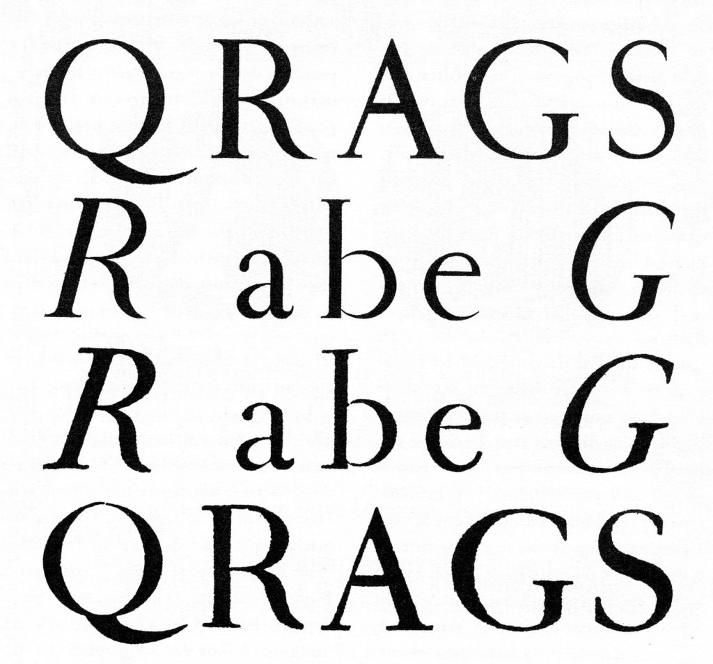
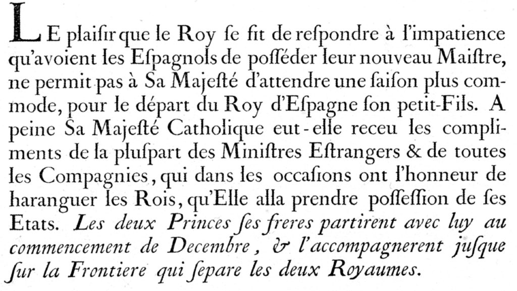
The original Romain du Roi, commissioned by King Louis XIV in 1692, was a product of the Enlightenment—a typeface born from rational design principles, meticulously crafted by the Bignon Commission and engraved by Philippe Grandjean. It stood as a symbol of the monarchy’s authority and the era’s intellectual rigor.

Ian Party’s fascination with this typeface began during his studies at the École cantonale d’art de Lausanne (ECAL) and deepened at the Type and Media program at The Royal Academy of Art in The Hague. His master’s project was a contemporary interpretation of the Romain du Roi, setting the stage for a career-long exploration.
In 2004, Ian co-founded B&P Typefoundry, which later evolved into Swiss Typefaces in 2013. Here, he released the initial versions of Romain BP and SangBleu BP (a lighter version of Romain BP), a typeface family that drew inspiration from the Romain du Roi’s structural elegance. By 2017, Ian had expanded SangBleu into a comprehensive collection—Empire, Kingdom, Republic, Versailles, and Sunrise—each reflecting different facets of typographic expression.
After selling Swiss Typefaces in 2019, Ian established Newglyph, a new venture allowing him to delve deeper into his typographic pursuits. Among Newglyph’s offerings is a modern reimagining of the Romain du Roi, not as a mere revival but as a continued quest to capture its spirit—one that celebrates the marriage of geometric rationality and elegance, of science and craftsmanship.

Conceived around the soft, crescent-like shapes of the ‘b’, ‘d’, ‘p’, and ‘q’, the design subtly appropriates regal motifs, including a distinctively adorned lowercase ‘l’, marked not by a simple additional serif but by what might be described as a typographic gesture of precision and flair. Rather than mimicking history, these ideas are synthesized and pushed toward something more radical, more distilled, and unequivocally more modern.

Technically, this contemporary Romain du Roi explores the full capabilities of variable font technology, with axes for weight, width, and contrast, yielding 108 styles in total. Alternates and small caps are available throughout the family as OpenType features.
At the heart of this typographic symphony lies a duet: Romain du Roi, the refined and articulate text family—crafted for rhythm, readability, and grace across long passages—and Le Grand, its dramatic and sculptural counterpart. Designed expressly for headlines, Le Grand is bold and theatrical, built with high contrast and typographic presence. Where Romain du Roi whispers with clarity in the flow of body copy, Le Grand declares, embellishes, and elevates. Together, they are two voices in harmony—serene and sonorous—each enhancing the other’s character, strength, and intent.
One will also find distinguishing details such as double serifs on lowercase letters like ‘b’, ‘d’, ‘h’, ‘k’, and the aforementioned ‘l’, each accentuated with careful articulation—a fusion of grace and rigor. These flourishes are not ornamental excess but rather deliberate gestures that honor the past while looking firmly forward.
Ian Party’s rendition of the Romain du Roi is a testament to his commitment to bridging historical reverence with modern design sensibilities. It is a narrative of passion, precision, and the enduring allure of typographic artistry.